Current visualizations available on your IMDB profile:
I created a dashboard using Flask and Zingcharts to visualize more patterns in your movie ratings:

Film runtime histogram:

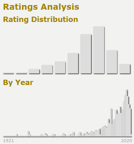
Ratings histogram, the bars on these charts can be hovered over to see more specific data:

Release year of films rated histogram:

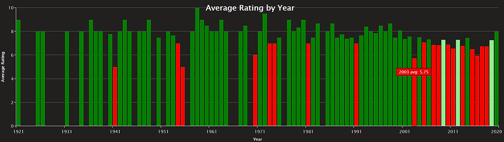
Average rating by year, green bars are above your average rating and red are below, light green are above the site's average rating for your rated movies but below your average rating:
Top 5 Over Rated Movies, this shows the top 5 films you rated highest relative to their IMDB site rating, as you can see I have rated A Bug's Life +2.8 points higher than the film's site rating:

Naturally, we also have Top 5 Under Rates:

More visualizations and visual improvements coming soon!
Comments